Events
Customize Create event screen layout
Choose how many columns appear on the Create event home page on desktop and mobile so staff can scan services quickly.
What you will accomplish
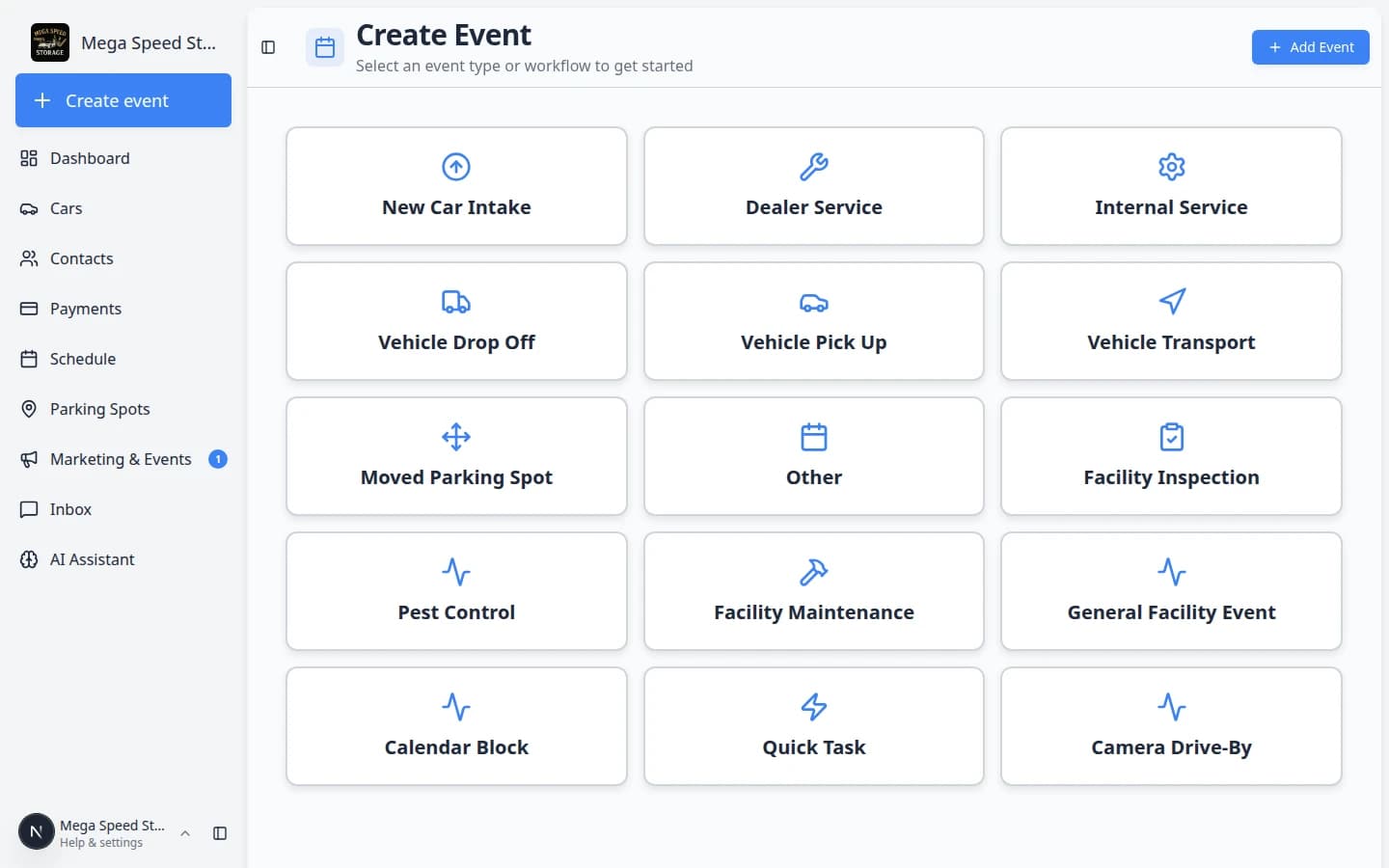
You will choose how many columns of event cards appear on the Create event home page—the large-button screen staff use to start drop-offs, details, pickups, and workflows.
Each team member saves their own desktop and mobile layout. Changes save automatically—you do not click a separate Save button.
When the layout fits your screen and role, staff can:
- Find the right service faster with fewer mis-taps.
- See more services at once on wide monitors—or fewer, larger cards on tablets.
- Keep a phone-friendly single-column view without changing what coworkers see on desktop.
When to adjust the layout
- Your facility has many event types and cards feel crowded on one row.
- Front-desk staff on tablets want fewer, larger cards (1 column).
- Wide monitors can show more cards at once (2 or 3 columns).
- A new teammate says the buttons are too small or hard to read—let them pick their own layout.
Before you start
- You can sign in as any staff user (each person sets their own layout).
- Event types exist so the Create event page shows a populated card grid. If the grid is empty, finish Configure event types first.
- Close the What's New pop-up if it appears (Got it) so it does not cover the layout buttons.
Open Create event screen layout settings
- Open Services & schedule
In the sidebar, open Settings, then click Services & schedule. You can also go directly to Settings > Services & schedule.
Expected result: You see the Services & event types table near the top of the page.
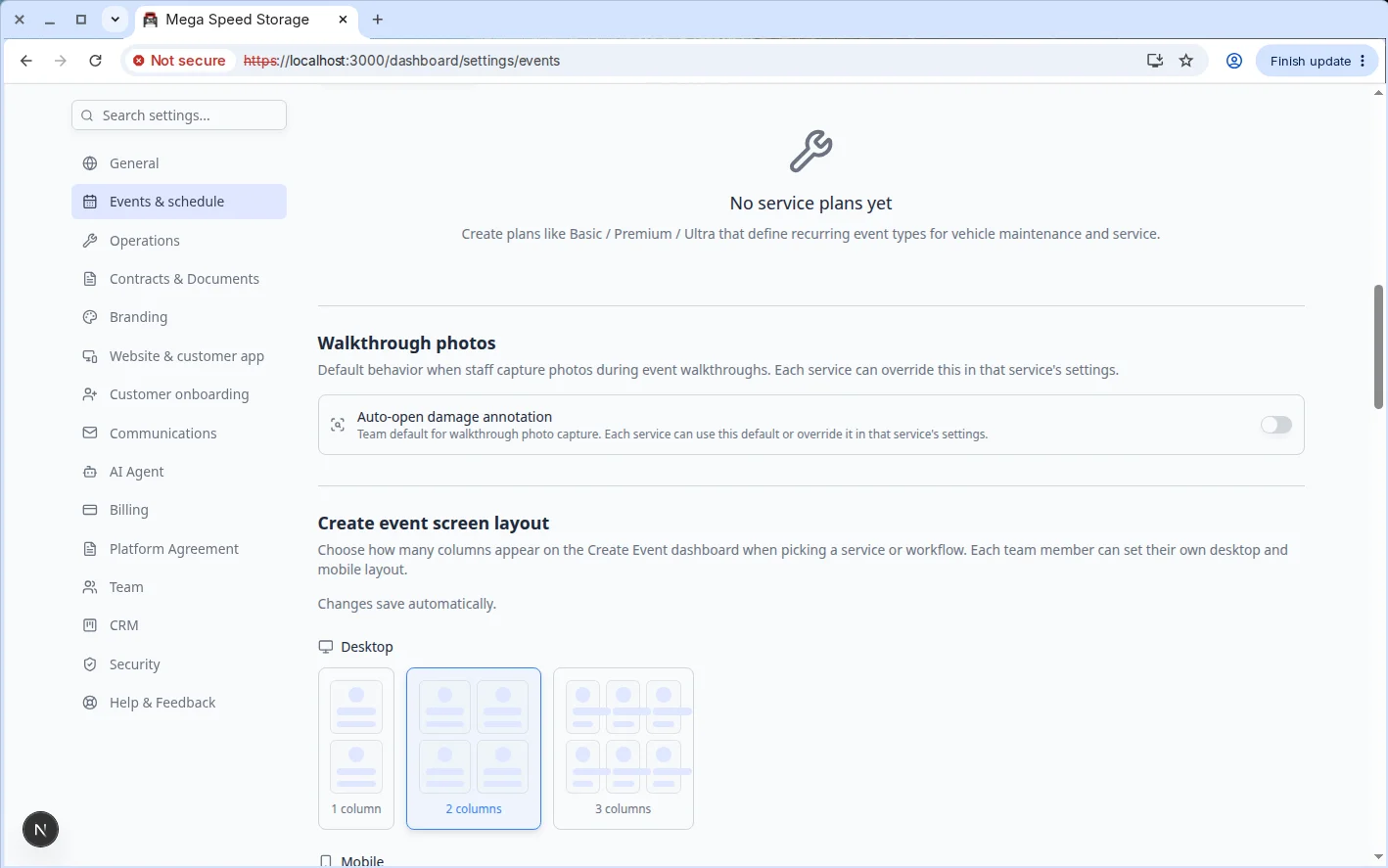
- Scroll to Create event screen layout
Scroll down past Service plans until you see Create event screen layout.
Why this matters: This section only changes how cards arrange on screen—not which services exist. Card names still come from your event types.
Choose desktop columns
- Find Desktop
Under Create event screen layout, find the Desktop row. You see three choices: 1 column, 2 columns, and 3 columns. Each shows a small preview grid.
Expected result: The option you last chose appears highlighted or selected.
- Click the layout you want
Click the option that matches your monitor and how many services you offer.
- 1 column — one card per row; best for large text, touch screens, and fewer mis-taps.
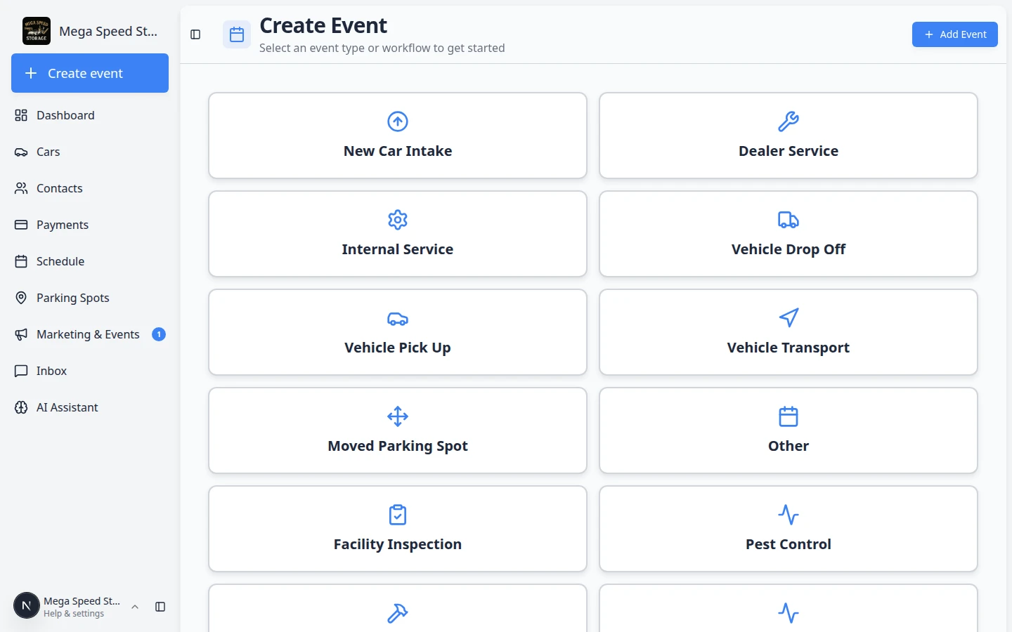
- 2 columns — balanced default for most laptops (see screenshot below).
- 3 columns — fits more services on wide screens without scrolling.
Expected result: Saved appears briefly near the section. Your choice applies the next time you open Create event on a desktop browser.
- Preview on Create event
Click Create event in the sidebar (or go to Create event) and count how many cards appear side by side.
Why this matters: Seeing the real page confirms the layout works for your eyes and screen size—not just the small preview in settings.
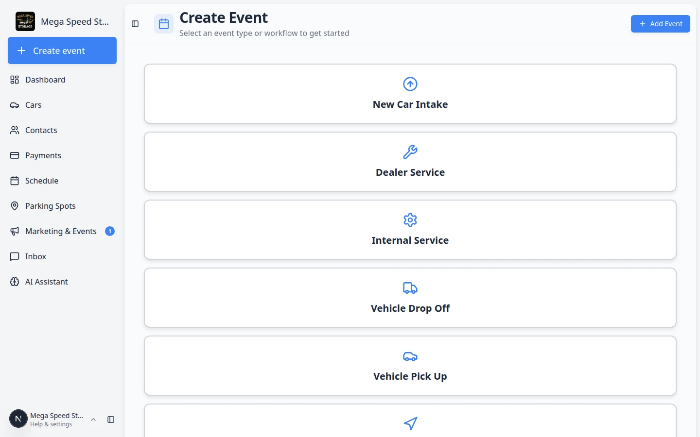
Compare 1 column and 3 columns
Try these if two columns still feels too tight or too spread out.
1 column — Best when:
- Staff use a tablet at the front desk.
- You want the largest possible tap targets.
- Your facility has only a handful of daily services.
3 columns — Best when:
- Staff work on a large monitor.
- You offer many event types and want less scrolling.
- Card labels are short enough to stay readable in a tighter grid.
Choose mobile columns
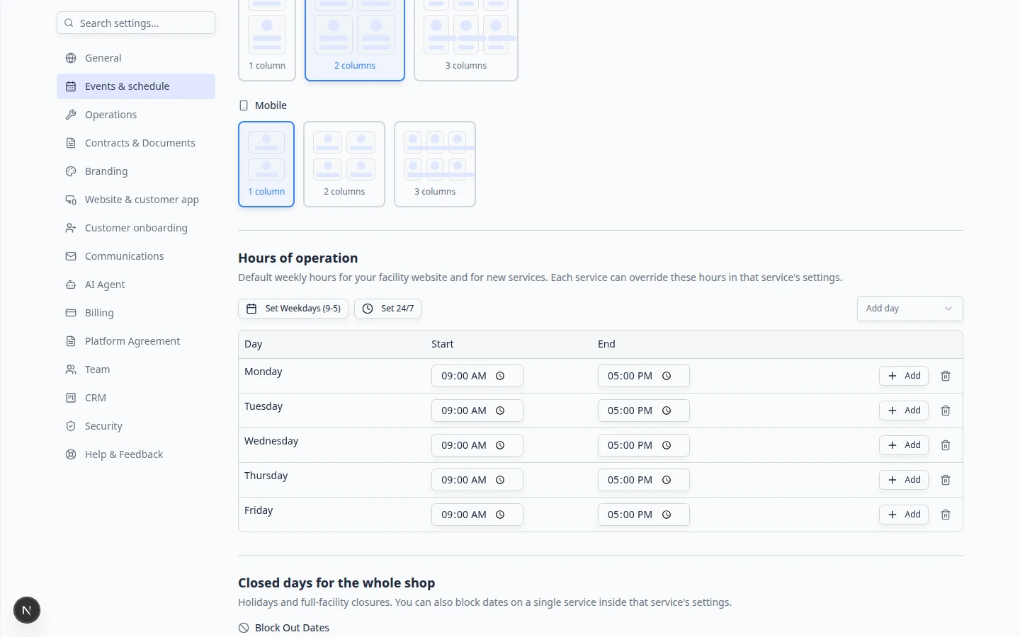
Mobile layout saves separately from desktop. A manager can use three columns on a monitor while a porter uses one column on a phone.
- Find Mobile
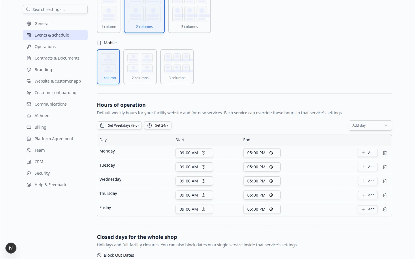
On Settings > Services & schedule, scroll to Mobile under Create event screen layout (phone icon).
- Pick 1, 2, or 3 columns
Most phone users prefer 1 column or 2 columns so card labels stay readable.
Why this matters: A three-column phone grid can make long service names wrap awkwardly or become hard to tap accurately.
- Wait for Saved
Click your choice and wait for Saved near the section.
Expected result: Open Create event on a real phone (or narrow your browser window) to confirm the mobile column count.
Important details
Personal preference — Your layout does not change other teammates' screens. Each staff member can pick their own desktop and mobile columns.
Automatic save — You do not click a Save button at the bottom of the page. Wait for Saved before closing the settings tab.
Cards come from event types — Layout only changes how cards arrange. Which cards appear still comes from Configure event types and Create operations workflows.
Inactive services are hidden — If a card is missing, the event type may be turned off. See Configure event types.
Troubleshooting
What to do next
- Train staff with Use the Create event home page.
- Add or rename services in Configure event types.
- Return to Events overview.