Product update
Clearer marketplace product choices
Public product and booking pages show each price option with photo, price, billing schedule, and a clear selected state—long descriptions open in a focused dialog.
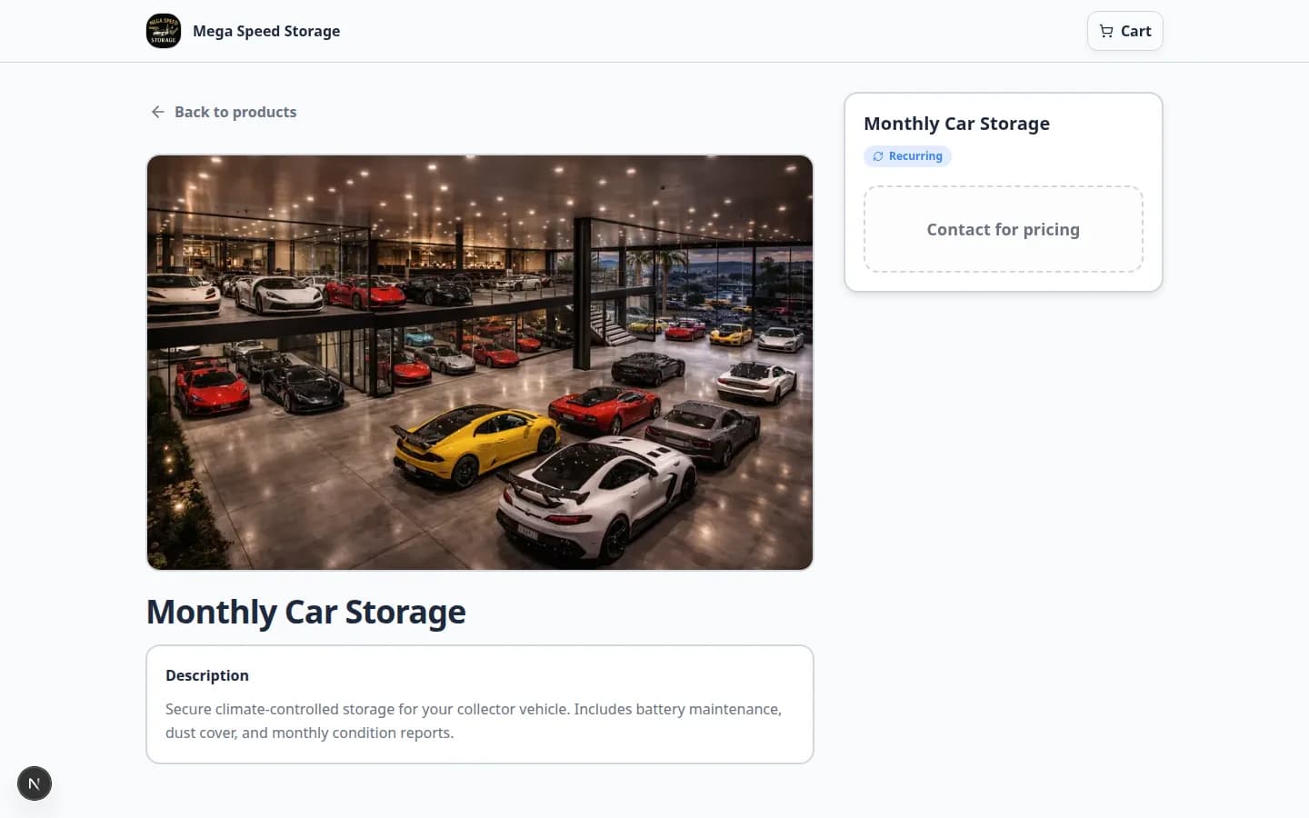
Collectors compare plans side by side before they commit to a recurring storage tier.
Why we built it
Marketplace variants often differ by photo, monthly vs annual billing, and paragraph-long descriptions—but old layouts buried those differences. Clearer marketplace product choices renders each option as a card with variant photo, price, billing schedule label, and a checkmark when selected. The hero image updates when shoppers pick a variant with its own art. Long HTML descriptions use ExpandableRichTextContent with a dialog so comparison stays scannable on mobile. The same variant model powers Add to cart checkout and scheduled booking forms on your public facility shop.
Who it is for
- Customers browsing
/facility/{slug}/marketplace/products. - Admins publishing options via Publish marketplace listings and Flexible marketplace listing controls.
- Teams pairing shop UX with Facility marketplace booking and checkout.
What you can do
- Upload per-variant photos so visual plans match what customers buy.
- Let shoppers see recurring interval text (for example monthly or annual) beside each price.
- Rely on a obvious selected border and check icon before checkout or booking submit.
- Keep lengthy variant copy behind Read more / dialog instead of endless scroll on the listing.
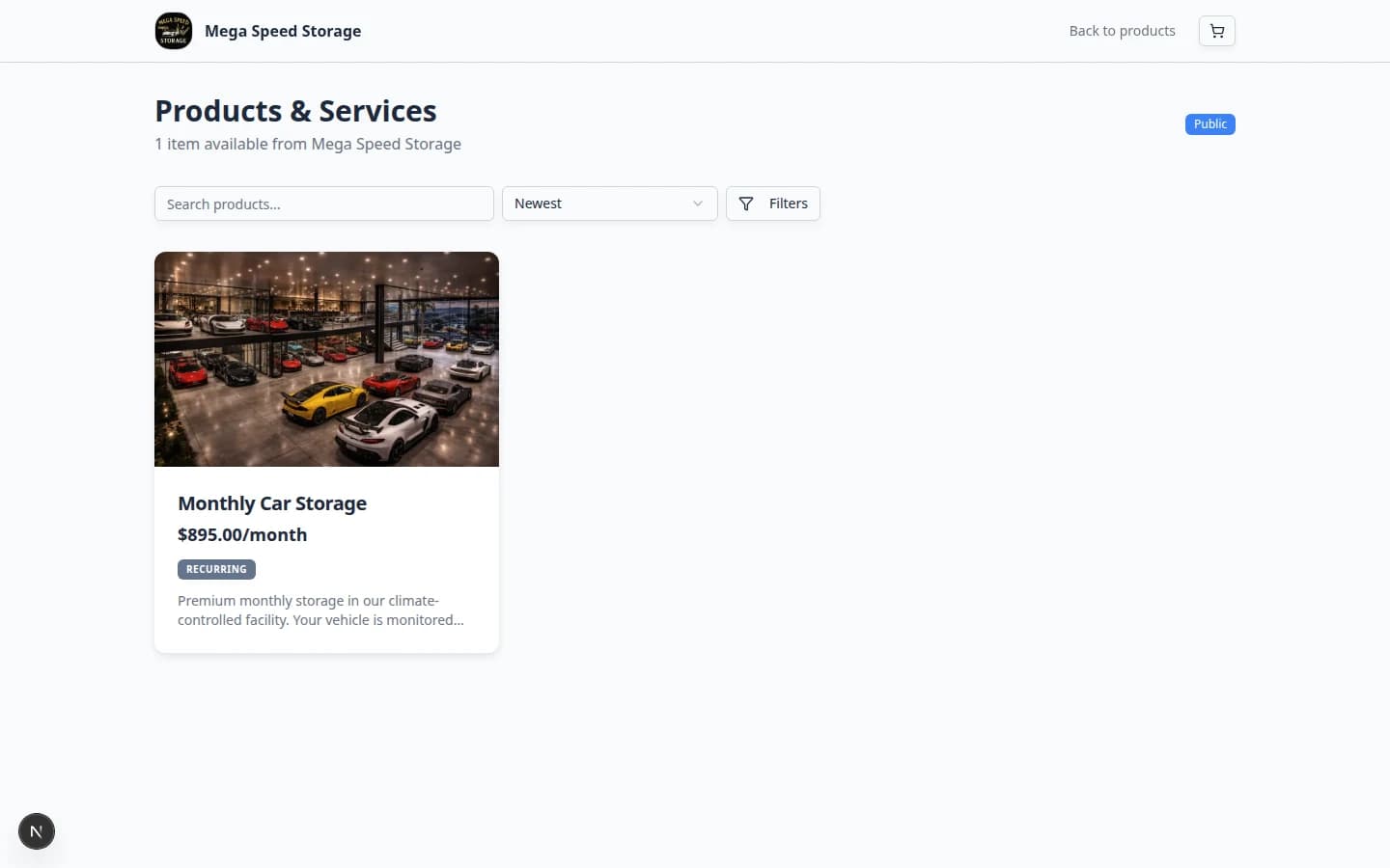
How it fits your day
When you add a second price tier, give each variant a distinct photo and short blurb; put legal or scope detail in the description field knowing shoppers can expand it. For booking-only products, the same cards appear in the MarketplaceBookingForm flow.
Get started
Open a multi-variant product on your public marketplace in a private window, tap each option, confirm the hero image and checkmark follow your selection, and open a long description dialog before adding to cart.
Questions about this update?
Book time with our team or browse the rest of the changelog.